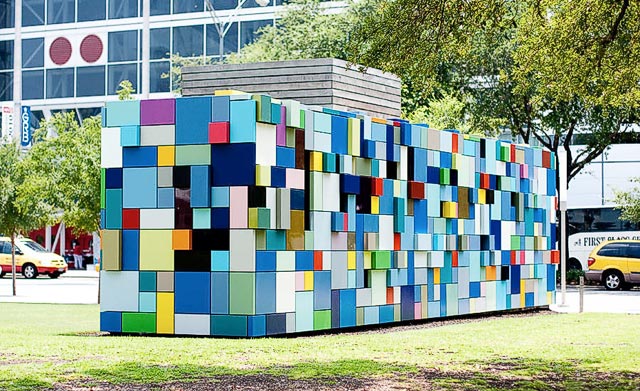
Margo Sawyer creates installations, in which she simplifies space into a “contemporary vocabulary”. She studies the relationships between the experience of space and the experience of transcendence, and the ways in which architecture and a ritual can coincide to create a purpose.
Her approach to color which she equates to a “Quilt of Color” alone is worth appreciating, especially for a graphic design person like myself. If there is anything I got out of her work it is some good color schemes I could use on some of my work. She uses aluminum box panels for large installations and wooden blocks for smaller constructions by laying them in a sort of grid like fashion. In all her works she investigates the relationship between color, light, and architecture.


The Contemplative Spaces installation is a grid like city scape arrangement of buildings. At a closer inspection individual shapes vary ranging from squares, rectangles, and circles even to some odd irregular shapes. The paint is not applied uniformly; the blue tones range from bright to faded. Although Contemplative Spaces on the surface does not seem spiritual because of its sheer simplicity, nonetheless she has incorporated spiritual and architectural practices of Hinduism and Buddhism by her use of color. Blue was inspired by the painted plaster houses of the Indian city of Jodhpur. More symbolic colors of the Hindu god Krishna, are red, yellow and green. For Sawyer, this colored installation refers to “ascension and otherworldliness”.
